Lark Pastry and Sweets Shop Logo
-
Client’s Request: The client envisioned a logo that encapsulates the joy and finesse of their sweets and pastry shop. They wanted a brand symbol that would resonate with the sweet warmth of their Syrian heritage, yet appeal to a contemporary international clientele.
-
Our Initial Inspiration and Ideas: Our brainstorming took flight like a lark at dawn. We thought of the early bird catching the worm, and instantly, the lark emerged as our muse—symbolizing diligence, joy, and a herald of good things. The notion of rising with the sun to create delightful pastries every morning inspired the design’s direction.
-
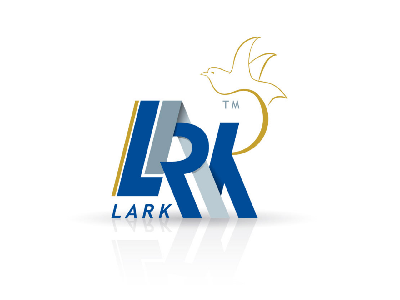
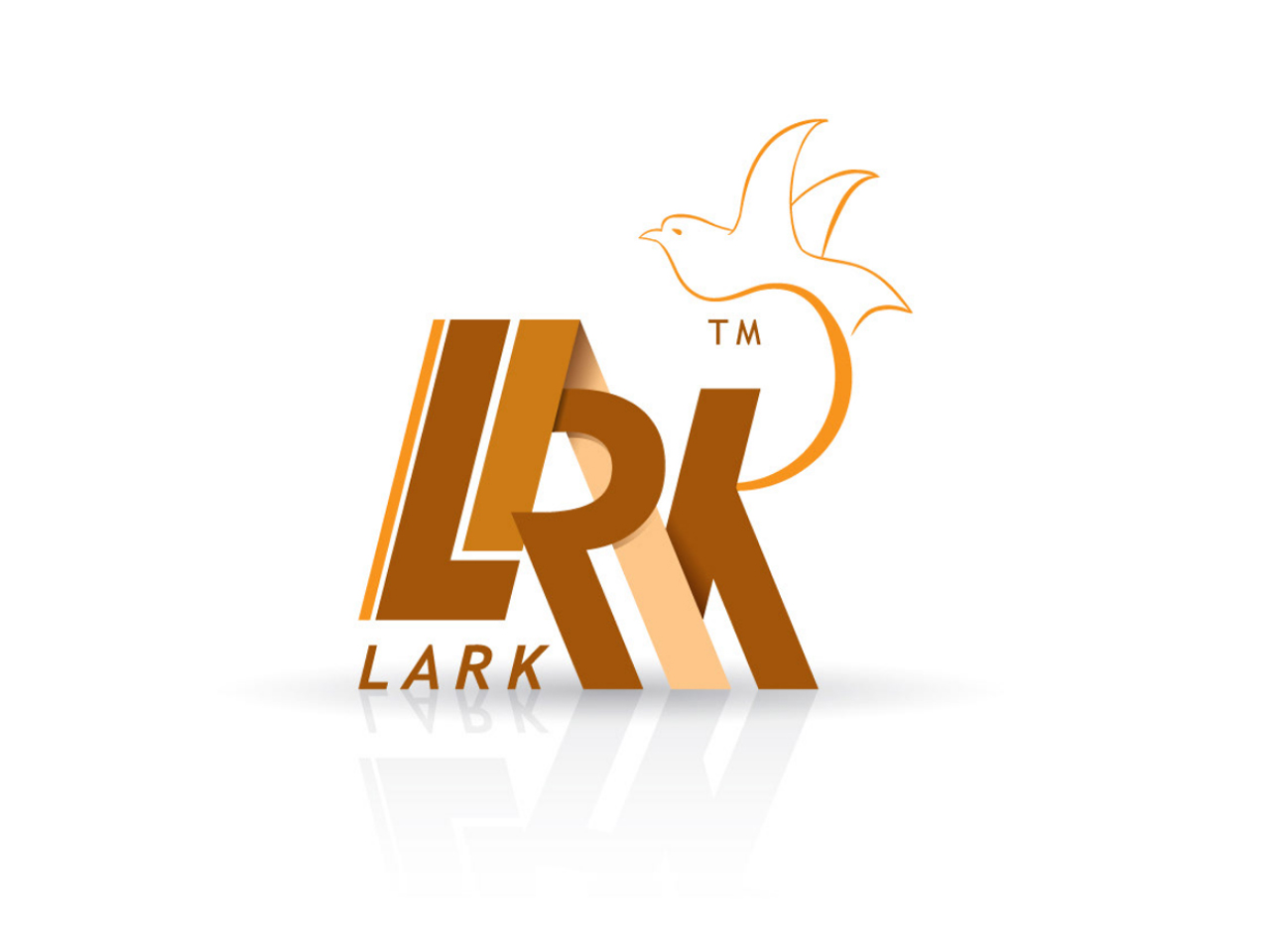
How We Approached It: We sculpted the letters to embody both tradition and innovation. The bold, clear typeface speaks to the shop’s steadfast commitment to quality, while the ascending bird captures the essence of aspiration and the uplifting experience of indulging in their offerings.
-
Colors We Used: The color palettes were chosen to reflect different aspects of the brand’s identity. The blue and white variant mirrors the freshness and purity of the ingredients, while the golden brown version evokes the comforting and inviting aroma of freshly baked goods.
-
Fulfillment of the Client’s Business Needs: By integrating the iconic lark into the logo, we crafted a visual hook that distinguishes the shop in the bustling Syrian market and beyond. The versatility of color schemes allows for diverse applications, from elegant packaging to vibrant signage, facilitating brand recognition and recall.
-
Audience Connection: The logo resonates with customers by capturing the sensory experience of the shop—sight, taste, and smell. The elegant lark in flight invites patrons on a sublime journey, much like savoring the shop’s sweets, which are art in their own right. It’s more than a logo; it’s a promise of joyful moments wrapped in the sweet embrace of Syrian hospitality.


