NUMO: Growth Interwoven
-
Client’s Request: NUMO, a cutting-edge financial consulting firm from Berlin, envisioned a logo that would embody growth and prosperity, rooted in the rich linguistic heritage of the Arabic language. Their request was to have the Arabic word نمو, meaning ‘growth’, seamlessly integrated into a visual identity that speaks to an international audience.
-
Our Initial Inspiration and Ideas: Inspired by the fluidity and elegance of Arabic script, our creative journey began. We aimed to design a logo that was not just a word, but a story of progress and advancement, mirroring the dynamic spirit of Berlin’s financial scene.
-
How We Approached It: We meticulously crafted the logo by intertwining traditional calligraphy with modern design elements. The resulting form is a harmonious blend that pays homage to Arabic artistry while standing firm in the contemporary business landscape.
-
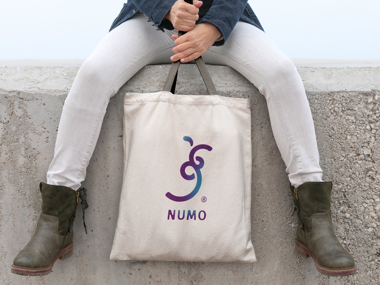
Colors We Used: The deep, monochromatic tones reflect the firm’s professional grounding, suggesting stability and trust. For a touch of vitality and differentiation, we introduced a sophisticated shade of purple on the merchandise, encapsulating NUMO’s innovative and forward-thinking ethos.
-
Fulfilment of the Client’s Business Needs: This logo transcends cultural boundaries, perfectly encapsulating NUMO’s identity as a bridge between markets and cultures. It’s adaptable across various platforms, ensuring a cohesive and recognizable brand presence that speaks both of tradition and the future.
-
Audience Connection: The logo’s fusion of Arabic calligraphy with a modern twist resonates with NUMO’s diverse clientele. It represents a shared journey of growth, reflecting the universal aspirations of NUMO’s customers and their commitment to fostering financial development.


